
Scary Font Generator
Halloween text needs to read as spooky at a glance, not buried under something so distorted it stops being readable, so this page leads with a coffin-shaped family: Coffin Gothic wraps a blackletter look in ⚰ marks for a haunted-house sign, Coffin Script pairs the same mark with a flowing cursive for something closer to a tombstone epitaph, and Coffin Cursed adds a light layer of glitch distortion for a shorter, more unsettling caption.
These sit apart from this site's creepy text generator, which leans further into gore and cursed-image territory — if Coffin Cursed still isn't extreme enough, that page picks up where this one leaves off.
Coffin Gothic14 characters
⚰ 𝕾𝖈𝖆𝖗𝖞 𝕱𝖔𝖓𝖙 ⚰
Coffin Script14 characters
⚰ 𝒮𝒸𝒶𝓇𝓎 ℱℴ𝓃𝓉 ⚰
Coffin Cursed59 characters
⚰ S̶̪̮̒̒ḉ̠̱̓ą̠̭̌́ṟ̶̮̔̌y̨̭̰̽͡ Ḟ̶̼̗̽o̴̠̊̃ͅņ̞̼͗̋ṱ̨̫̋̉ ⚰
Creepy (Mild)55 characters
S̶̪̮̒̒ḉ̠̱̓ą̠̭̌́ṟ̶̮̔̌y̨̭̰̽͡ Ḟ̶̼̗̽o̴̠̊̃ͅņ̞̼͗̋ṱ̨̫̋̉
Gothic / Fraktur10 characters
𝔖𝔠𝔞𝔯𝔶 𝔉𝔬𝔫𝔱
Upside Down10 characters
ʇuoℲ ʎɹɐɔS
How It Works
Type your text, tap Copy on the style you like, then paste it anywhere — it's plain Unicode text, so it works everywhere. See the full walkthrough with screenshots.
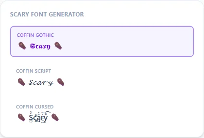
A coffin-shaped family built for general Halloween use
Coffin Gothic and Coffin Script both keep the same ⚰ frame but swap the base style — blackletter for a haunted-house sign, flowing script for something that reads more like an epitaph. Coffin Cursed adds a light zalgo-style distortion on top of the same frame, for when "spooky" needs to tip into "unsettling" without going all the way to unreadable.
How this page differs from the creepy text generator
Both pages use the same underlying Unicode combining-mark technique, but they're tuned for different moods. This page's coffin family stays on the general Halloween/spooky end — pumpkins, ghosts, haunted houses — and keeps even its most distorted style, Coffin Cursed, comfortably readable. The creepy text generator instead pushes toward gore, cursed images, and demon-adjacent horror, with intensity settings that go well past what's here.
Picking an intensity for a caption vs. a longer message
Coffin Gothic or Coffin Script both hold up fine at any length. Coffin Cursed's added distortion reads best in a short caption or a single line — stack it across a full paragraph and the combining marks start to overlap and slow down reading, the same tradeoff every distortion style on this site runs into at high intensity.
Frequently Asked Questions
Is this the same as the creepy text generator on this site?
+
No — both use the same combining-mark technique, but this page's coffin family stays on the general spooky/Halloween end while the creepy text generator leans further into gore and cursed-image territory with more extreme intensity settings.
Will Coffin Cursed still be readable?
+
Yes, at a normal caption length — it only adds a light distortion layer on top of the ⚰ frame, noticeably lighter than this site's Zalgo Wild or Cursed styles on the creepy text generator page.
Can I use these styles for a Halloween party invite, not just social captions?
+
Yes, they're plain Unicode text so they paste into a printed invite, an Evite, or a group chat message the same way they display here.
Is there a lighter option if I don't want any glitch effect at all?
+
Yes — Coffin Gothic and Coffin Script both use the ⚰ frame with no added distortion, so pick either of those over Coffin Cursed if full readability matters more than an unsettling edge.
Do these styles work for horror content outside of Halloween specifically?
+
Yes, nothing about the underlying characters ties them to the holiday — they read fine year-round for horror-themed posts, game usernames, or story titles.
Will this text paste correctly into a Discord nickname for a Halloween-themed server?
+
Yes, though Discord enforces its own length limit per field — if a longer phrase gets cut off, try a shorter word or Coffin Gothic instead of the wider Coffin Script.