Fancy Font Alphabet
Before generating your own word, it can help to see the full alphabet in a given style, since some styles have letters that look very different from the plain alphabet (gothic capital letters especially).
Type any text into the tool below to see it rendered across every style at once, or jump straight to a single letter's own page below for a closer look at just that one character.
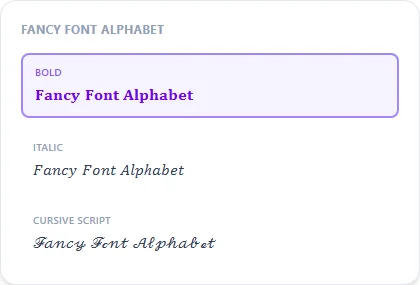
Bold19 characters
𝐅𝐚𝐧𝐜𝐲 𝐅𝐨𝐧𝐭 𝐀𝐥𝐩𝐡𝐚𝐛𝐞𝐭
Italic19 characters
𝐹𝑎𝑛𝑐𝑦 𝐹𝑜𝑛𝑡 𝐴𝑙𝑝ℎ𝑎𝑏𝑒𝑡
Cursive Script19 characters
ℱ𝒶𝓃𝒸𝓎 ℱℴ𝓃𝓉 𝒜𝓁𝓅𝒽𝒶𝒷ℯ𝓉
Bold Cursive19 characters
𝓕𝓪𝓷𝓬𝔂 𝓕𝓸𝓷𝓽 𝓐𝓵𝓹𝓱𝓪𝓫𝓮𝓽
Gothic / Fraktur19 characters
𝔉𝔞𝔫𝔠𝔶 𝔉𝔬𝔫𝔱 𝔄𝔩𝔭𝔥𝔞𝔟𝔢𝔱
Double-Struck19 characters
𝔽𝕒𝕟𝕔𝕪 𝔽𝕠𝕟𝕥 𝔸𝕝𝕡𝕙𝕒𝕓𝕖𝕥
Bubble19 characters
Ⓕⓐⓝⓒⓨ Ⓕⓞⓝⓣ Ⓐⓛⓟⓗⓐⓑⓔⓣ
Squared19 characters
🄵🄰🄽🄲🅈 🄵🄾🄽🅃 🄰🄻🄿🄷🄰🄱🄴🅃
Small Caps19 characters
ꜰᴀɴᴄʏ ꜰᴏɴᴛ ᴀʟᴘʜᴀʙᴇᴛ
How It Works
Type your text, tap Copy on the style you like, then paste it anywhere — it's plain Unicode text, so it works everywhere. See the full walkthrough with screenshots.
Browse by Letter
Why browsing the alphabet helps before you generate a word
Most fancy font styles are a clean, predictable letter-for-letter swap, but a few, especially Gothic/Fraktur, have capital letters that look dramatically different from the Latin alphabet most people expect (a Fraktur capital 'A' barely resembles a plain 'A' at a glance). Scanning the full alphabet first avoids surprises when you later generate a specific word or name in that style.
Copying individual letters vs. a full word
Type a single letter into the tool above to get just that character in every style, or use one of the 26 individual letter pages below — useful for building an acronym, an initial, or a short tag rather than a full sentence.
A quick tour of the main alphabet styles
Bold and Italic come straight from the Mathematical Alphanumeric block and read closest to a normal typeface. Script and Bold Script are flowing, connected letterforms built for bios and invitations. Fraktur is blackletter/Gothic — heavy, medieval, and the one style where capitals diverge the most from the Latin alphabet. Double-Struck (also called blackboard bold) draws each letter as a hollow, doubled-line outline; several of its capitals reuse the exact symbols mathematicians use for number sets, like ℝ for real numbers and ℕ for naturals. Circled and Squared wrap each letter in a bubble or box for a playful, gaming-friendly look. Small Caps shrinks every letter to a uniform small-capital height for a clean, minimal line.
Alphabet fonts vs. installing a real font
A real font file only works where it's installed — paste text formatted with it into Instagram or Discord and the formatting strips away, leaving plain letters. Every style on this page is a different Unicode character standing in for each letter, so the styling is part of the text itself. It travels with the text through copy-paste, no installation, download, or app required, and it works identically on any device that renders standard Unicode.
Frequently Asked Questions
Can I copy individual letters from this page?
+
Yes — type a single letter into the tool above to get just that character in every style, or open that letter's own page from the grid below.
Are single-letter pages (like 'A in fancy font') available?
+
Yes — every letter A through Z has its own dedicated page showing that one letter across all styles. Browse them in the grid below.
Why do gothic capital letters look so different from the alphabet I know?
+
Fraktur/gothic capitals are based on a genuinely different historical letterform tradition than the sans-serif alphabet most people read daily — the lowercase letters stay much more recognizable than the capitals.
Does every style include both uppercase and lowercase letters?
+
Most do, but a few decorative or symbol-based styles only define one case — those letters fall back to the closest available form rather than being left unstyled.
What's the difference between Double-Struck and Bold?
+
Bold draws each letter as a solid, heavier version of the normal shape. Double-Struck (blackboard bold) draws each letter as a hollow outline with a doubled stroke — the style math textbooks use for number-set symbols like ℝ and ℤ. They're visually distinct, not just different weights of the same idea.
Why do a few letters look identical to their normal form when upside down?
+
Letters like H, I, N, O, S, X, and Z are symmetrical enough that rotating them 180 degrees produces the same shape (or very close to it) — it's a property of the letterform itself, not a gap in the upside-down style.
Do these alphabet fonts work for languages other than English?
+
The styles here are built for the Latin A-Z alphabet. The Greek font generator covers the Greek alphabet separately if that's what you need.
Can I use a single fancy letter as a logo or initial?
+
Yes — that's exactly what the individual letter pages are for. Pick a style, copy just that one character, and drop it into a bio, design, or username wherever a single styled initial fits better than a full word.