
Brat Font Generator
The Brat aesthetic (Charli XCX's 2024 album cover) is built on a blur no font-substitution trick can copy — plain, unstyled, lowercase Arial, smudged just enough to feel a little illegible. Unicode text can't blur, so instead of faking that, Brat Lowercase does the one part of the look this site can actually deliver: it forces whatever you type into plain lowercase, in a clean sans-serif, no matter how you typed it in.
If lowercase alone doesn't feel distinct enough on its own, the rest of the site's 160+ styles are listed below — Sans Bold and Monospace both keep a similarly plain, unadorned feel if Brat Lowercase reads too close to normal typing.
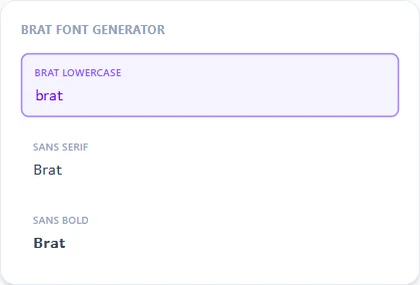
Brat Lowercase9 characters
𝖻𝗋𝖺𝗍 𝖿𝗈𝗇𝗍
Sans Serif9 characters
𝖡𝗋𝖺𝗍 𝖥𝗈𝗇𝗍
Sans Bold9 characters
𝗕𝗿𝗮𝘁 𝗙𝗼𝗻𝘁
Monospace9 characters
𝙱𝚛𝚊𝚝 𝙵𝚘𝚗𝚝
How It Works
Type your text, tap Copy on the style you like, then paste it anywhere — it's plain Unicode text, so it works everywhere. See the full walkthrough with screenshots.
Why this page can't fully recreate the album cover look
The Brat cover's font isn't a distinct typeface — it's a plain, default-looking sans-serif (Arial Standard) deliberately blurred and slightly warped in the artwork itself. Unicode has no "blur" character, since every style on this site works by swapping letters for different-but-still-sharp lookalike characters, not by distorting pixels. That means no combination of Unicode characters can reproduce the smudged look directly — what this page offers instead is the one honest, achievable piece of it.
What Brat Lowercase actually does
Brat Lowercase forces every character you type to lowercase before displaying it, regardless of the case you typed it in — useful on a phone keyboard that auto-capitalizes the first letter of every sentence, since the album's branding is famously never capitalized. It renders in a clean sans-serif, the closest plain, default-looking base this site has to Arial Standard.
Using this for a caption, bio, or playlist name
Because the output is plain lowercase Unicode text, it pastes anywhere plain text goes — an Instagram caption, a Spotify playlist name, a bio, or a group chat name. It won't carry the cover's signature blur into any of those places, but it will keep the lowercase-only formatting intact everywhere it's pasted.
Frequently Asked Questions
Does this really look like the Brat album cover?
+
Not the blur specifically — Unicode text can't replicate that smudged effect. What it does deliver is the lowercase-only formatting, which is the other core piece of the aesthetic.
Why does Brat Lowercase ignore capital letters I type?
+
That's the point of the style — it forces every character to lowercase on output, so it works even if your keyboard auto-capitalizes the first letter of what you type.
Is there a way to add the blurry look to my text?
+
Not through this tool — that effect comes from image editing, not font or character substitution, so it's outside what a Unicode text generator can do.
Can I use this for a Spotify playlist name or Instagram caption?
+
Yes, the output is plain Unicode text, so it pastes into either the same way it displays here.
Is Brat Lowercase different from just typing in lowercase myself?
+
Functionally, no — the difference is convenience. It guarantees lowercase output even if you type with capitals, autocorrect, or a keyboard that capitalizes automatically.
Do any other styles on this site fit the Brat aesthetic?
+
Sans and Sans Bold both share the same plain, unadorned look if Brat Lowercase feels too close to normal typing, though neither forces lowercase the way Brat Lowercase does.