Metal Font Generator
Metal band logos typically combine sharp gothic/blackletter lettering with jagged, distorted marks — Bold Gothic and heavy glitch text get closest to that look without needing a custom logo design.
Creepy (Cursed) gives the most extreme distortion; Iron Runes swaps in an angular rune-like alphabet for a heavier, more metal-specific feel.
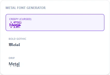
Creepy (Cursed)235 characters
M̵̶̵̵̴̺̫̝̪̠̗̼̺̬̞̽̆̈́̌̇̄ͧ̍͑̽ȩ̴̶̨̨̤̤̯̤̻̹̜̹̦̜̽̃̌͒̔̄͗̀̌͡ţ̵̵̵̧̫̝̺̭̞̯̙̯̻̪́̔̊̈̍̋̎̆͡͡â̴̵̶̧̧̪̘̩̫̫̯̱̱̜ͧ̃̆ͧ̃̒̏̇̎ͅļ̵̴̶̴̠̥̜̼̰̫̱̯̹̤̏̋̊͒̔̄̈̇̉͡ F̵̵̵̴̧̺̪̜̦̜̮̗̦̟̖̌̔͗̋̅̌̉̆̌̔ǫ̶̶̶̧̪̩̞̬̖̜̻̟̠̃̊̐͒̌̄̂̃̆̎ͅn̶̶̵̶̶̝̤̤̰̗̙̮̻̭͗̏̏̽͗̂͒ͧ̋͡ͅţ̶̴̧̨̝̞̟̗̟̪̪̝̥̮̆͑̐ͧ̐̎̽̍̏̎
Bold Gothic10 characters
𝕸𝖊𝖙𝖆𝖑 𝕱𝖔𝖓𝖙
Drip37 characters
M̹̦̺e̘̘̦t̗̦̖a̠̤̠l̫̱̻ F̥̫̯o̭̥̝n̬̞̥t̜̬̤
Iron Runes10 characters
ᵯēⱦⱥł ӻꝋꞥⱦ
How It Works
Type your text, tap Copy on the style you like, then paste it anywhere — it's plain Unicode text, so it works everywhere. See the full walkthrough with screenshots.
The two ingredients of a metal-logo look
Metal band logos, especially death and black metal ones, typically layer two things: sharp gothic/blackletter letterforms and jagged distortion marks that make the lettering harder to read at a glance (a deliberate genre convention, not an accident). Bold Fraktur supplies the first; Zalgo Wild or Drip supply the second. Combine them for a fast preview of that combined effect.
Iron Runes for a heavier, more angular alternative
Iron Runes swaps in an angular, runic-inspired Unicode alphabet instead of gothic lettering, for bands or usernames that want something sharper and less traditional than blackletter.
Frequently Asked Questions
Is this based on a specific metal band's logo?
+
No, it's a general sharp/distorted look built from gothic lettering and glitch marks, not a reproduction of any specific band's actual logo design.
What are Iron Runes?
+
An angular lookalike alphabet drawing on runic-style Unicode characters — reads as heavier and more metal-specific than standard gothic lettering.
Good for an actual band logo, or just a preview?
+
Treat it as a fast preview of lettering direction — a real band logo benefits from a designer who can hand-adjust spacing, sharpness, and readability for print and merch.
Does this work for a black metal vs. death metal distinction?
+
The generator doesn't distinguish subgenres specifically — Iron Runes leans sharper and more angular, while Bold Fraktur with Drip leans more classically gothic; try both against your band name.