LinkedIn Fonts
LinkedIn is the one platform on this site where restraint matters more than decoration. A heavily styled post can look unprofessional, so this page sticks to clean, readable styles rather than anything decorative.
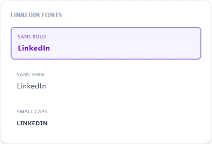
Modern Bold (Sans Bold) is the most common choice for a headline or post opener that needs to stand out without looking like a meme.
Sans Bold14 characters
𝗟𝗶𝗻𝗸𝗲𝗱𝗜𝗻 𝗙𝗼𝗻𝘁𝘀
Sans Serif14 characters
𝖫𝗂𝗇𝗄𝖾𝖽𝖨𝗇 𝖥𝗈𝗇𝗍𝗌
Small Caps14 characters
ʟɪɴᴋᴇᴅɪɴ ꜰᴏɴᴛꜱ
How It Works
Type your text, tap Copy on the style you like, then paste it anywhere — it's plain Unicode text, so it works everywhere. See the full walkthrough with screenshots.
Why LinkedIn gets a deliberately shorter style list
Every other platform page on this site features decorative or playful styles because that fits the platform's culture. LinkedIn is different — a glitch, zalgo, or heavily bracketed post reads as out of place in a professional feed, so this page only surfaces Sans Bold, Sans, and Small Caps, the three styles that add emphasis without sacrificing a clean, readable, work-appropriate look.
Where to use it: headlines and post openers
A bold opening line is a common, low-risk way to make a LinkedIn post stand out in a feed of plain paragraphs — used sparingly, for one line rather than an entire post, it reads as intentional formatting rather than decoration.
Frequently Asked Questions
Is it professional to use styled text on LinkedIn?
+
A restrained bold headline is common and generally fine; heavily decorated or glitchy styles read as out of place in a professional context — that's why this page only features clean, simple options.
Where should I use this — headline, post, or profile name?
+
Post openers and headlines are the most common use; LinkedIn's actual name field has its own rules separate from post text.
Should I style my whole post, or just the first line?
+
Just the opening line or a key phrase — styling an entire post can hurt readability and comes across as less professional than a plain paragraph with one bold opener.
Will recruiters or connections see styled text differently?
+
It displays the same to everyone since it's standard Unicode, not a special formatting feature; the main consideration is tone, not technical compatibility.